Google Drive Unveils Smarter, Sleeker Document Scanner UI on Mobile
If you have ever scanned a document on your phone and thought, “This could be easier,” pay attention – Google Drive just made that wish come true. The app now features a refreshed document scanning experience, rolling out with a cleaner design, easier editing tools, and a smarter layout for handling your scanned documents.
What’s New in the Scanning Experience?
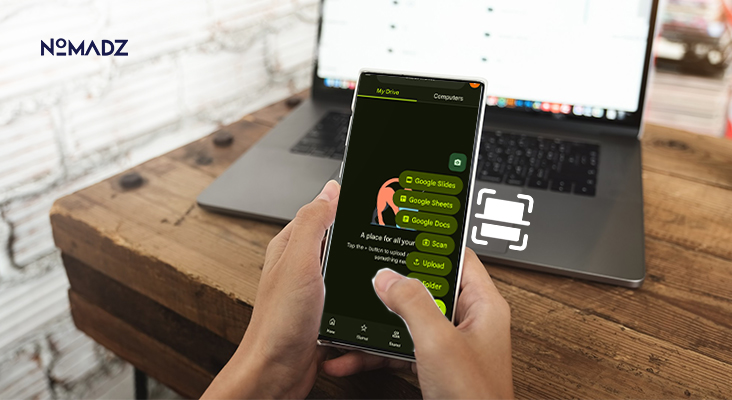
Once a document has been captured in Google Drive, you end up with a full-screen preview that has been programmed to present all the details clearly. The small thumbnails will be a thing of the past, and you will have big swipeable previews with each page clearly visible before editing.
Just below these previews is a revamped toolbar based on Google’s latest Material 3 Expressive design. Here, you’ll find intuitive icons for enhancing, applying filters, cropping, rotating, deleting, or retaking scans. It’s all conveniently placed for faster access.
Better still, a draggable thumbnail carousel lets you quickly navigate between pages, reorder them, or delete extras-all with a tap and drag. Then, when everything looks good, just hit “Next” to upload your scanned document. These improvements are now available to all users-whether you’re on a personal account or part of Google Workspace.
Also Read: Location-Based Marketing: Drive Sales with Smarter Targeting
Why It Matters?
It is not a facelift. The redesign would lead the life into efficiency with respect to individuals who frequently read and write documents on frequently. When you sell, teach, or do digital paperwork regularly, you save time and frustration with this smoother experience.
It also results in the same Material 3 appearance, which also translates into a more coherent experience across the Google ecosystem, between Drive and Docs, and Gmail, and it can be more readily slipped into a workflow without losing a beat.
Smarter Editing Tools
According to Google’s own updates, this redesign lives up to its promise of making scanning faster and more seamless for mobile users. The improved page previews help you catch missed details, while the embedded editing tools eliminate extra steps in your workflow.
In the past, users relied on older features like shadow removal, white balance correction, and contrast improvements to salvage tricky scans. Now, Google is integrating next-gen enhancements into the editing journey itself, meaning less tapping between screens and more smooth productivity.
Who Gets It and When?
The rollout began on September 1, 2025, and is now available to Android users with Google Workspace or personal Drive accounts. Whether you’re a professional subscriber or casual user, this update is landing in your Drive app sooner rather than later.
While Android is first to receive it, a similar experience for iOS users may follow soon, making it a game-changer across mobile platforms.
The Bigger Picture
What we are looking at here is not a single enhanced feature but a part of the overall work of Google to make things easier with digital documents. Google is making Drive look more like a productivity center rather than a cloud storage locker by honing features such as scanning and organization.
The increasing popularity of remote work and hybrid environments makes intelligent, easy-to-use tools that enable you to capture and edit documents with a single button press a luxury.
Also Read: Email Marketing in the Age of AI and Zero-Click Journeys
Conclusion
Google Drive’s latest scanner redesign combines functional elegance with smart design. Bigger previews, simplified editing options, and simplified page navigation make the document scanning experience on mobile fast, clean, and friction-free. This will be a welcome upgrade if you are one of those people who scan, whether at work or in life.


Leave feedback about this